Pangea
Pangea is a company that provides web-enabled software solutions for in-store marketing, mainly targeting grocery, retail, and wholesale industries. They help businesses manage signage, price tags, and promotional displays efficiently across multiple locations. Their key platforms include SignShare for creating and distributing signage, MarketShare for price-integrated shelf advertising, and Tags for automated retail price tag management. Pangea’s tools reduce labor costs, ensure brand consistency, and streamline in-store marketing operations.
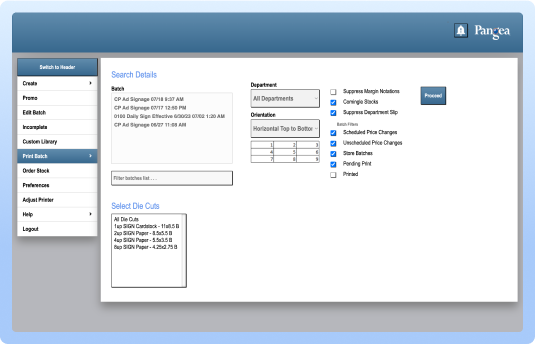
Original Platform
Problem Statement
The client’s brief was to redesign their software, which is used at both store and division levels by their customers, for managing signs and tags. Their goal was initially to tweak and improve certain designs within their existing system. However, during the redesign process, the project evolved into a full software restructure. New features were introduced to make the software scalable, intuitive to the end users and reimagine the userflow of the software.
Challenges
After a decade without updates, Pangea’s software design required a comprehensive refresh to modernize its interface and user experience.
-
Experiencing difficulty with app navigation
-
Struggling to find specific screens efficiently
-
End users found the software time-consuming to navigate when printing signs and tags
-
System lacked quick, efficient workflows for printing, slowing down turnover.
-
Onboarding new employees was difficult and required dedicated trainers due to complex workflows.
-
The overall design felt outdated and inconsistent, reducing usability and visual appeal.
Timeline
July 2024 - Jan 2025
(Launched)
Role
UX/UI Designer (Research, Visual Design, Design system, Experience Design & Auditing)
Team
Team work with technical design manager, worked closely with the client's team, internal dev engineer and project manager
Uncovering Existing Platform
We began the project with a thorough system audit, since everything was new and required a learning curve. Understanding the platform took time, so we spent a week uncovering features and identifying opportunities for restructuring. Because the navigation was messy and unclear, it became our next priority after a Q&A session with the client to clarify how the software was intended to work. I laid out the existing screenshots, audited the flows, and documented areas for improvement. From there, I created ideas and consideration notes to guide discussions with the client and align on potential solutions.
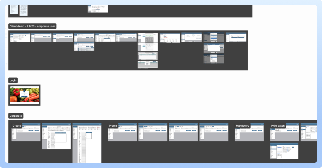
Auditing the existing system
-
Auditing & Considerations
We used the existing tool to identify the UX problems faced by users. Since there were no solid, user-friendly flows in place, we had to uncover and define them ourselves through exploration and analysis. During the audit, we created detailed notes highlighting opportunities to improve features and enhance usability.
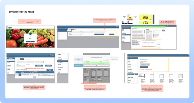
Auditing the division level
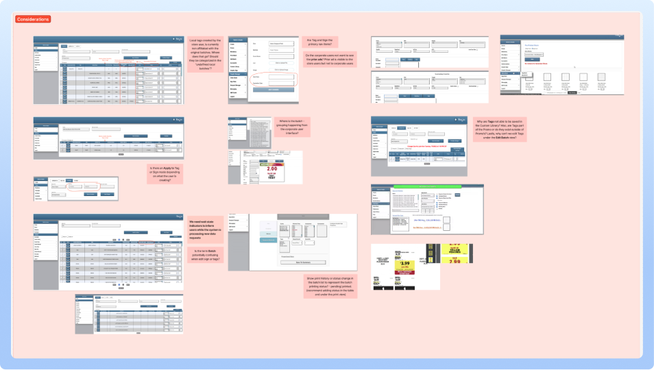
Ideas and considerations
-
Site Map & Navigation
Through our audit, we discovered that the navigation was cluttered and overwhelming, with 10–12 items. We streamlined it down to 6 core items, carefully identifying, grouping, and naming them to create a more intuitive structure. We also created a site map that allowed us to see the overall structure of the platform, identify redundancies, and clarify how different sections connected. Alongside this, we visualized the screens in very rough figjam sketches to communicate our progress and share the evolving ideas with the client.
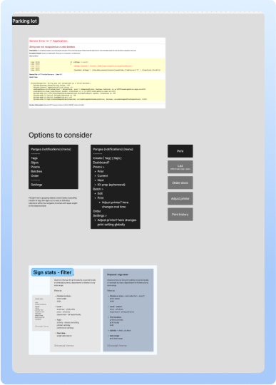
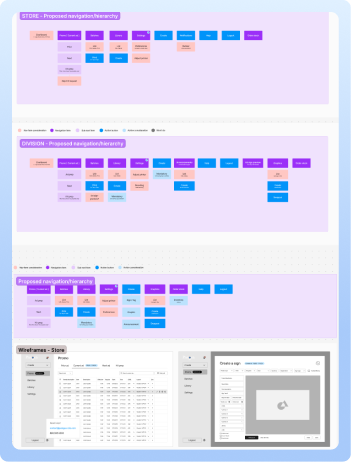
Ideating potential navigation & Site map
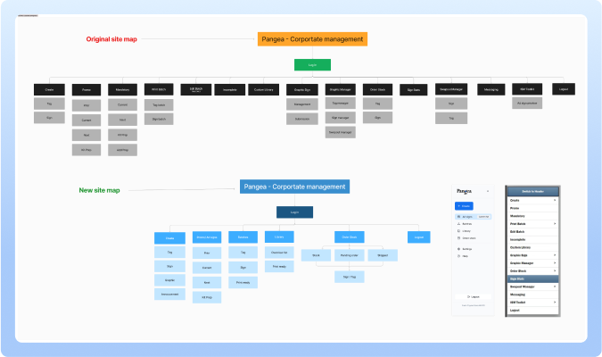
Site architecture (old & new proposed)
-
Permission Matrix
We built a permission matrix to address the two main user types within the system. Since there were overlapping and inconsistent features across the two existing systems, the matrix helped us tally, compare, and identify what was missing or redundant. This not only clarified which features worked but also guided us in restructuring the system while avoiding confusion for the client and the team.The third user type focused solely on permissions and not the end users of the product, which we mapped out to better understand and organize the client’s backend system.

Permission matrix by features & usertypes
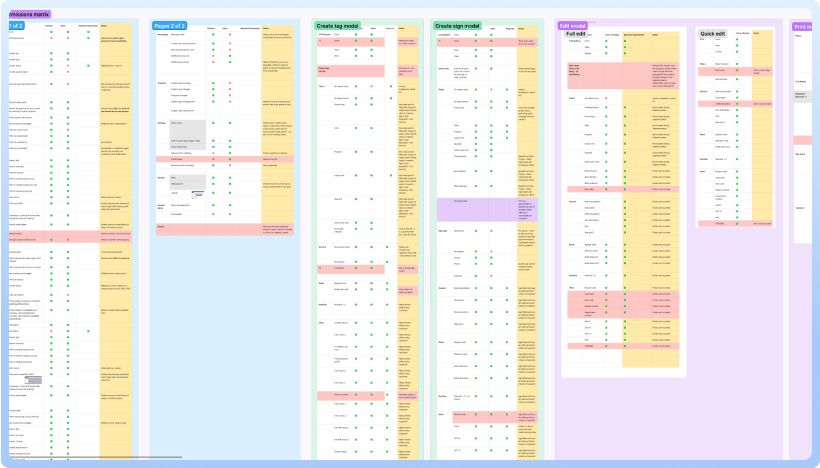
All of permission tables
-
Lo-fi Sketches or Wireframes
We built a permission matrix to address the two main user types within the system. Since there were overlapping and inconsistent features across the two existing systems, the matrix helped us tally, compare, and identify what was missing or redundant. This not only clarified which features worked but also guided us in restructuring the system while avoiding confusion for the client and the team.The third user type focused solely on permissions and not the end users of the product, which we mapped out to better understand and organize the client’s backend system.
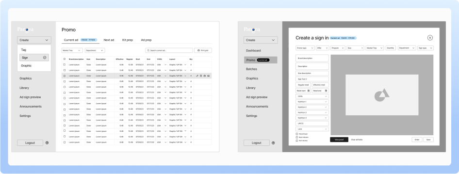
Visualising the major screens & navigation

Store & division key screens (Batch view + Creating new sign)
Design System
The client didn’t have an existing design system or defined brand colors, and their idea of “blue” was very vague. We assisted them in selecting a primary color based on accessibility guidelines and market research. Using this as a foundation, we created the components in Figma.
Due to a limited budget and the fact that an incorrect brief was created based on visual redesign, the project took the turn to resolve more problems and required extra time for discovery phase. We invested significant time and effort in uncovering the client’s features and understanding their needs before moving into hi-fed design, ensuring that the solutions we delivered were both practical and well-informed.
-
Design Components
The components were initially custom-designed but were later at development stage they were transitioned to Material 3 (M3) components for consistency and scalability. The dev time was limited and didn't workout to create the custom components, so we had to change the components to M4 in the design files.
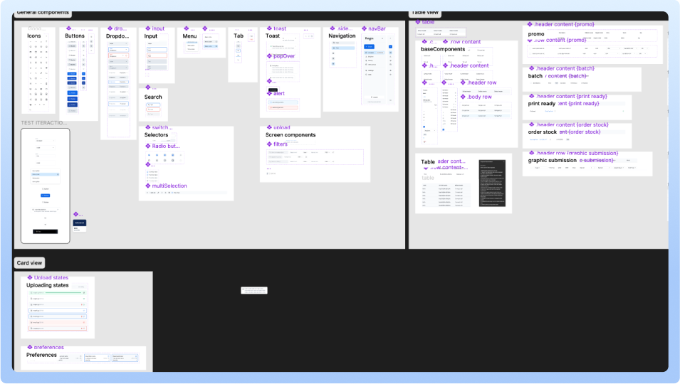
Design components custom to the project
-
Style Guide
After selecting the primary color, we put together a basic style guide. With a tight budget, the project managers spent extra time resolving issues and coordinating with the dev team on feature details. While that was happening, design team created quick design components to keep things moving enough to work with for the hi-fi wireframes and to prototype buttons, hover states, and basic interactions. There wasn’t enough time or budget for a full component library, so the team focused on prioritizing on the usability more than visual design.

Defining colors, variables & rearrranging the department
Design wireframes
Following this, I initiated wireframing iterations for each navigational item as per the project manager's directives. The redesign process commenced with the dashboard, followed by the calendar, incorporating various views. Subsequently, attention shifted to refining sections for clients, projects, people, profiles, account settings, and insights. Due to time constraints, the design phase couldn't accommodate extensive opportunities for rapid interactive prototyping. However, it managed to achieve the bare minimum by supplementing designs with notes and flows for the dev team. Close communication with the dev team in the fast-paced environment ensured alignment and efficiency in implementation.
1. Ad Signs & Promo
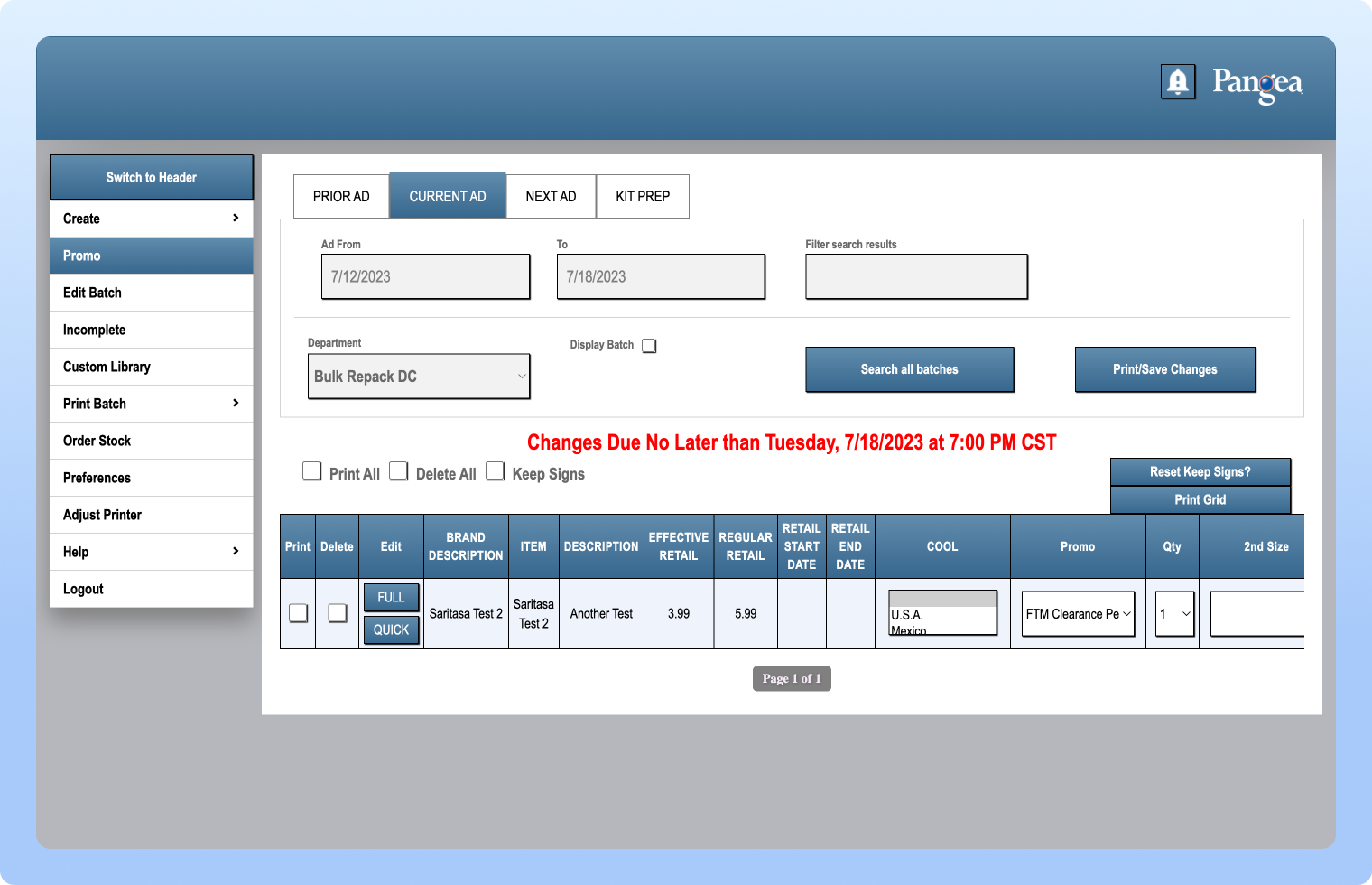
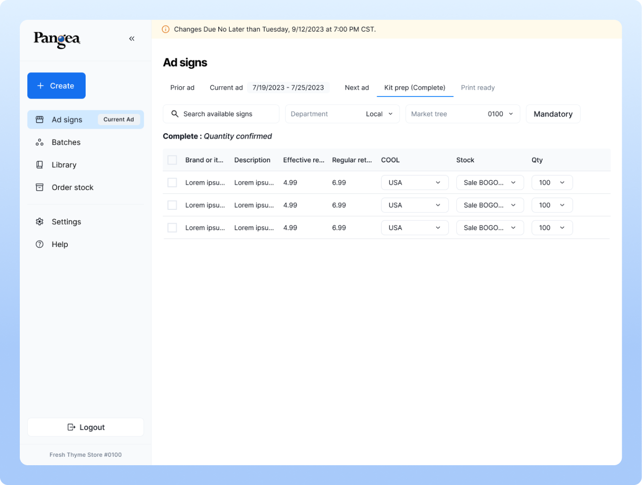
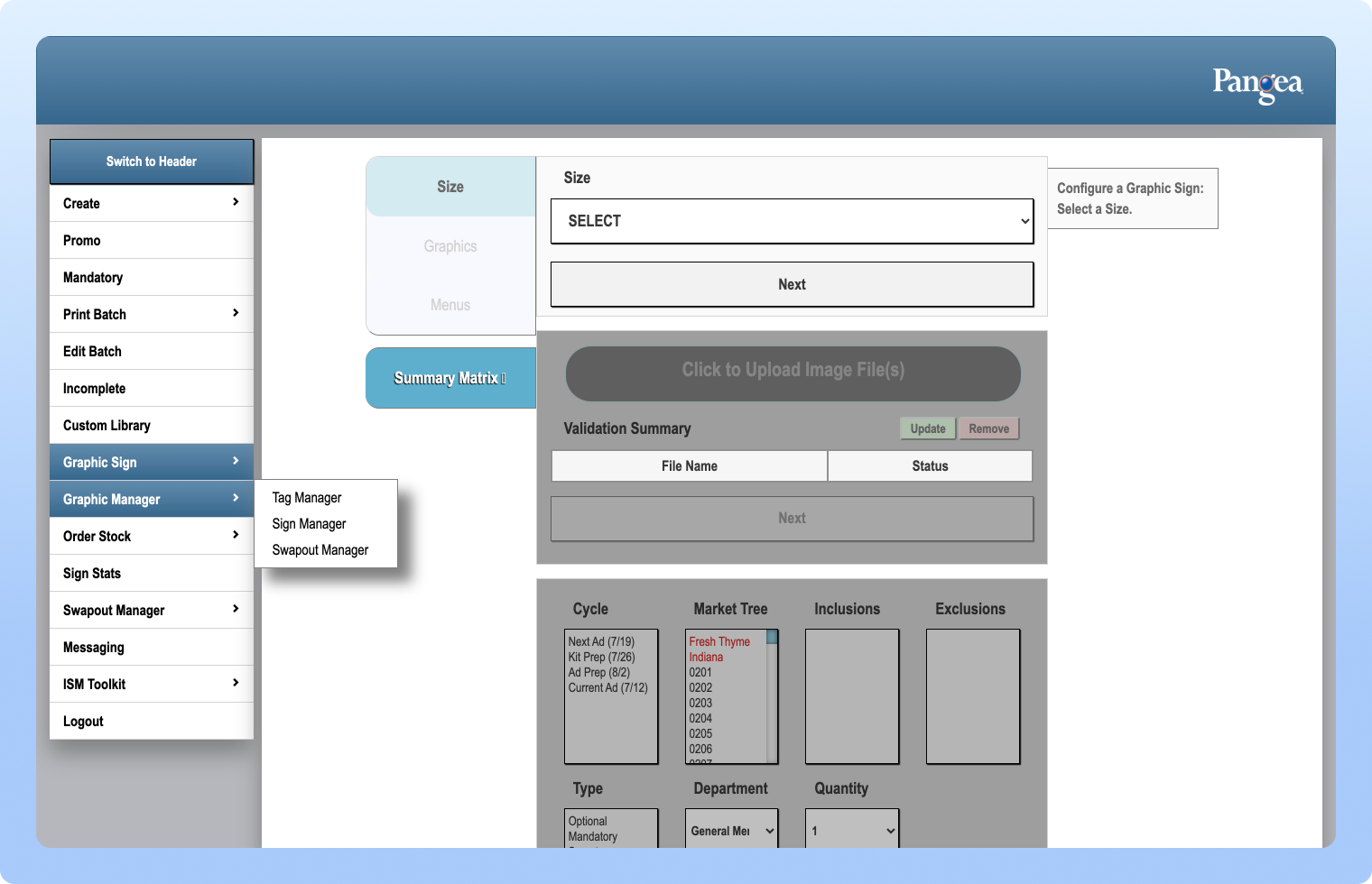
The Promo feature allows the division to send store materials to print, whether it’s discounts for a specific week or kit prep. The original design had issues with the search functionality, it didn’t filter results when clicked. The announcement placement was also awkward and distracting, disappearing as soon as the user reviewed it.
In the redesign, visual clarity has been greatly improved, including better navigation and introducing filter menu next to the search bar. Tags have been added next to the ad signs menu, making it easy to see which promo the user is viewing. Notifications appear next to the tags. A new “Print Ready” tab has also been added, once the user prints any promo item, the queue is automatically generated in this print ready tab.
2. Create Sign or Tag
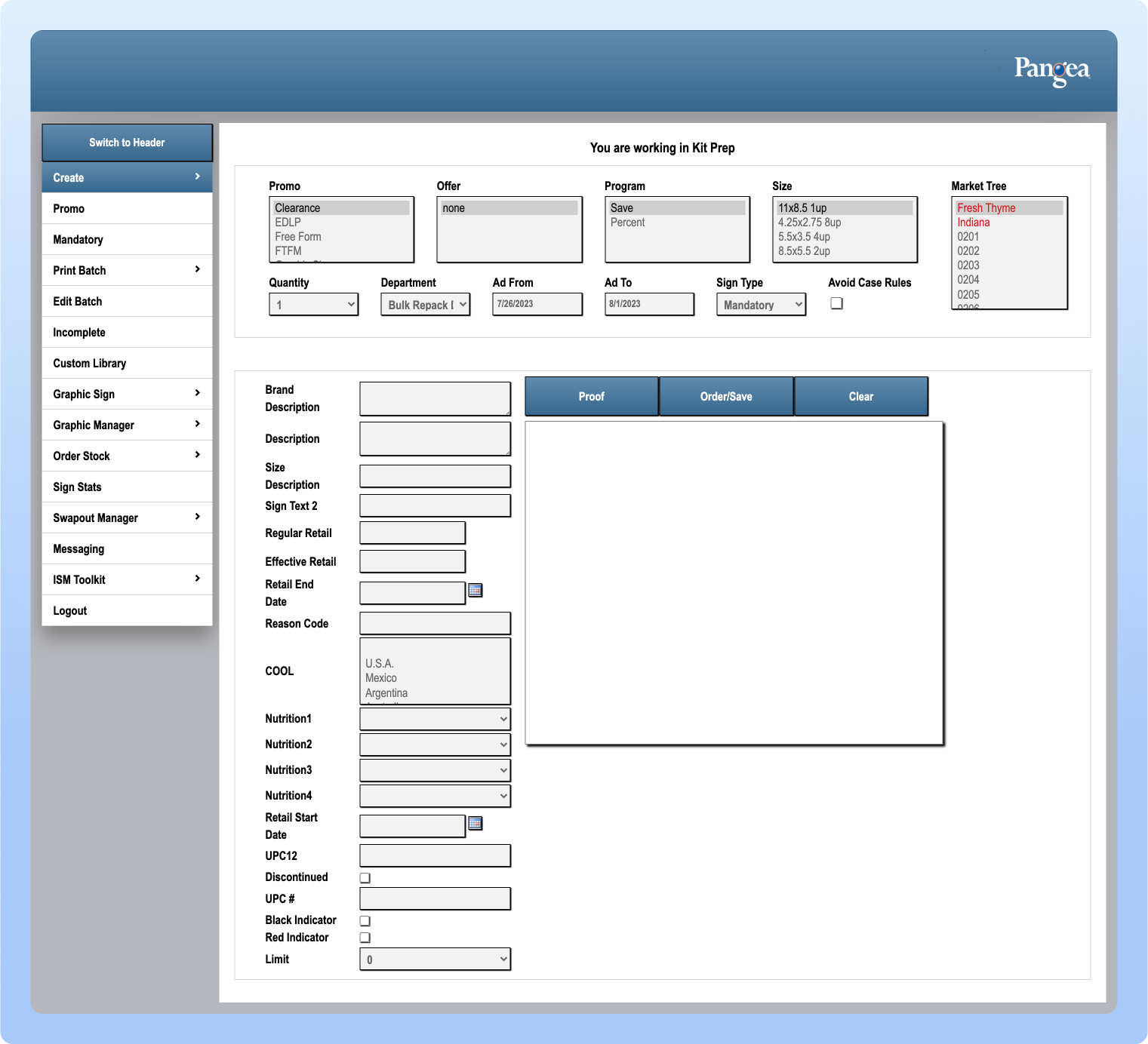
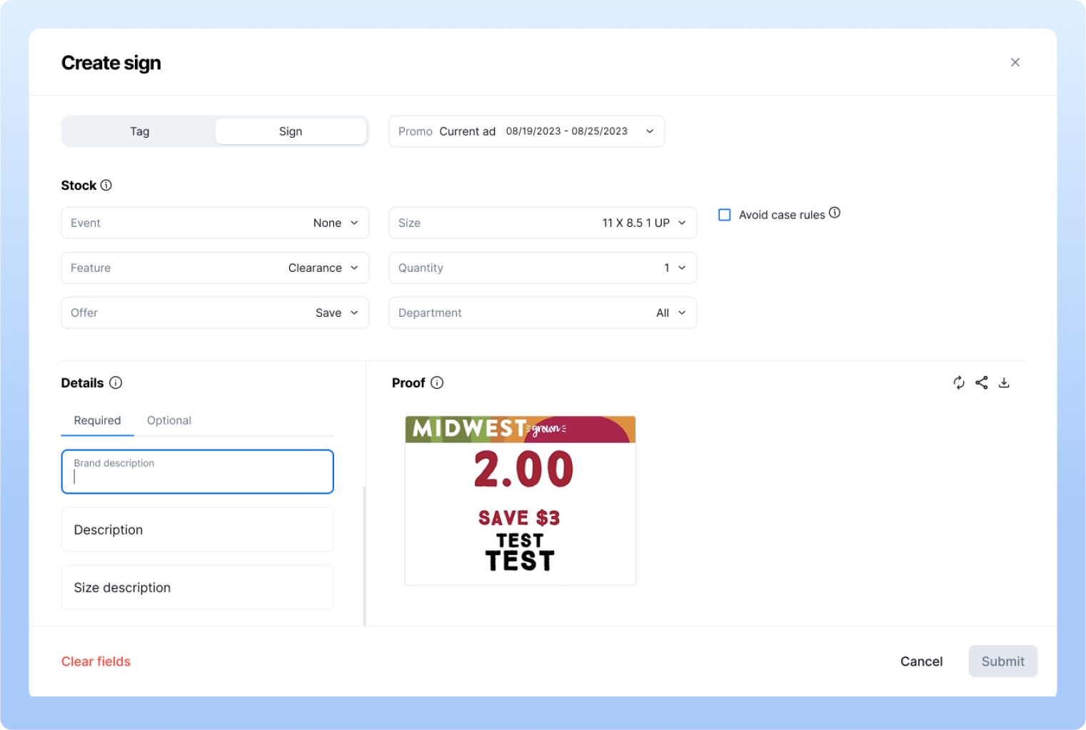
Create Sign and Tag feature is one of the most important one for the users, as they rely on it daily. In the original system, there were too many scattered filters and redundancies, which made usability difficult. There were so many input fields and there no classification of required or optional inputs. To improve the flow, we streamlined the process and introduced small but impactful functions. For example, as users type information to create a sign or tag, they now see a live proof in the preview column showing exactly how the print will look, we introduced the quick loading mechanism than having to click on the button in the existing system.
Previously, the create modal didn’t provide the clarity, leaving users confused if they had clicked a sign or tag creation. We redesigned it with a switch button that allows users to toggle between creating a sign or a tag, even if they clicked the wrong option initially. To avoid mistakes, an alert prompts them to save or discard their work before switching. The new full-screen modal also keeps users oriented within their batch, while reducing distractions from the navigation menu with 12-15 items which makes it overwhelming for the end users.
3. Batch functions (Edit, Process, Print, Delete or Change Settings)
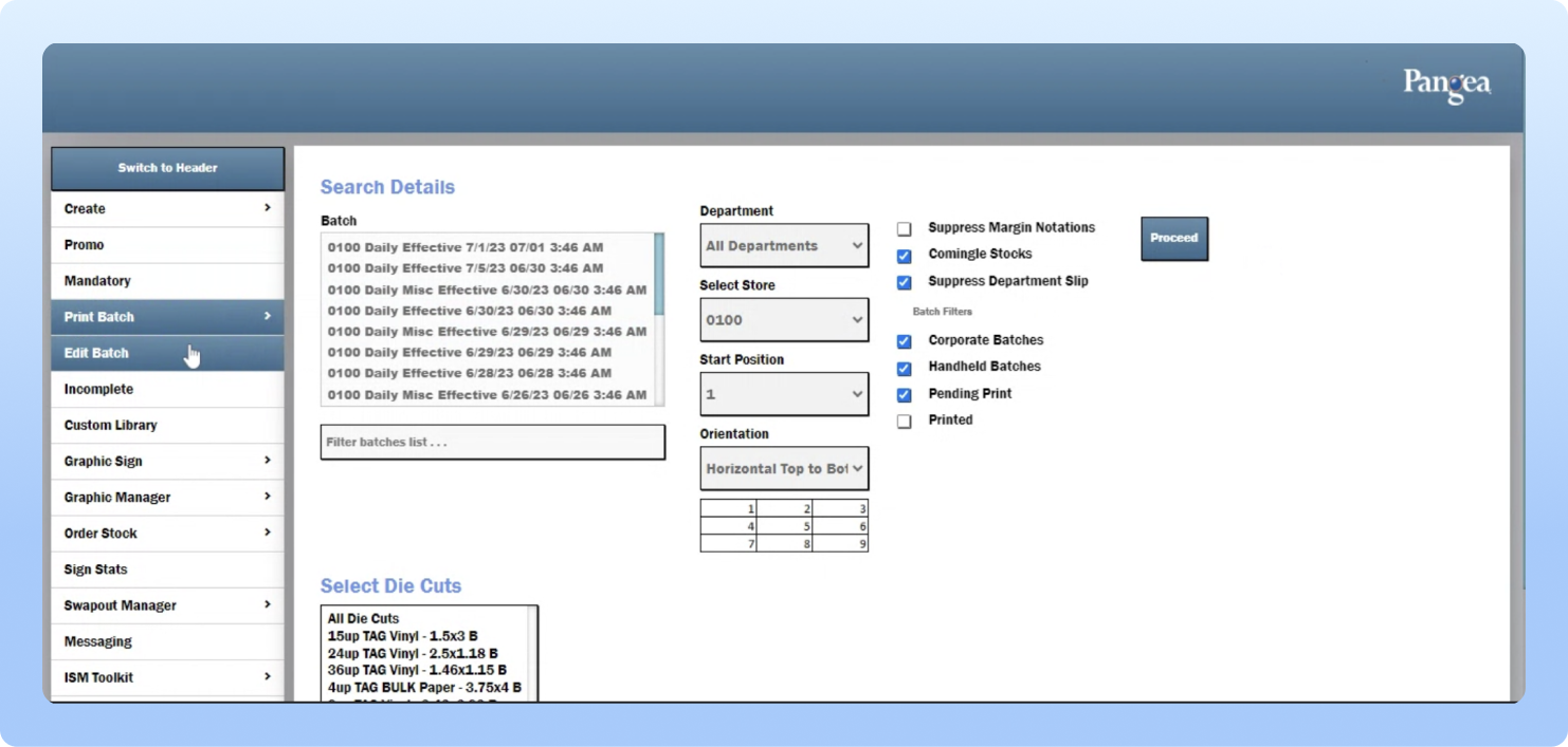
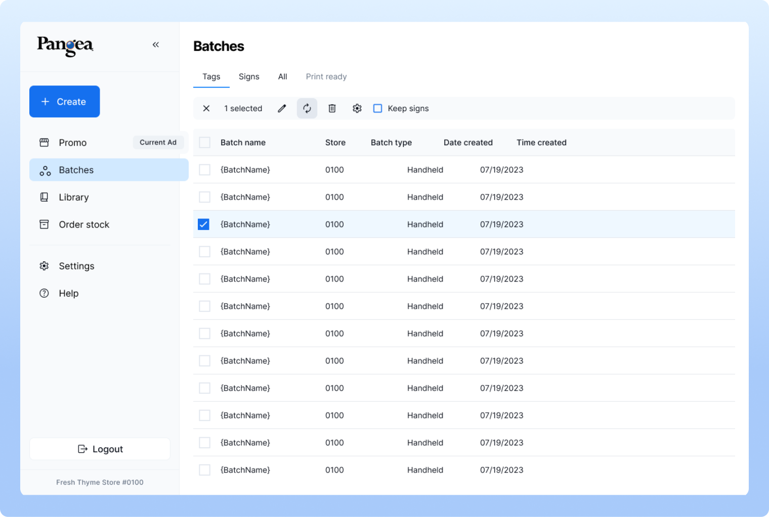
In the current system, there’s no dedicated page to view or edit items within a batch. Store managers either have to go into Promo to print items or use the Print Batch navigation to check and print them, which makes editing especially difficult. Our redesign introduced flexibility by allowing users to process items for printing, edit individual items or entire batches, delete them, and even adjust settings when needed as well as being able to view the batch detail page allows user to check items separately. This created a more organized and efficient workflow compared to the original design. Additionally, batches are now clearly categorized as Sign Batches, Tag Batches, or All categories, improving clarity and usability.
4. Printing batch or individual items
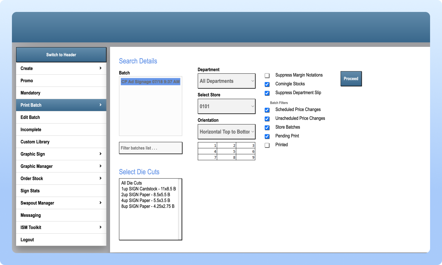
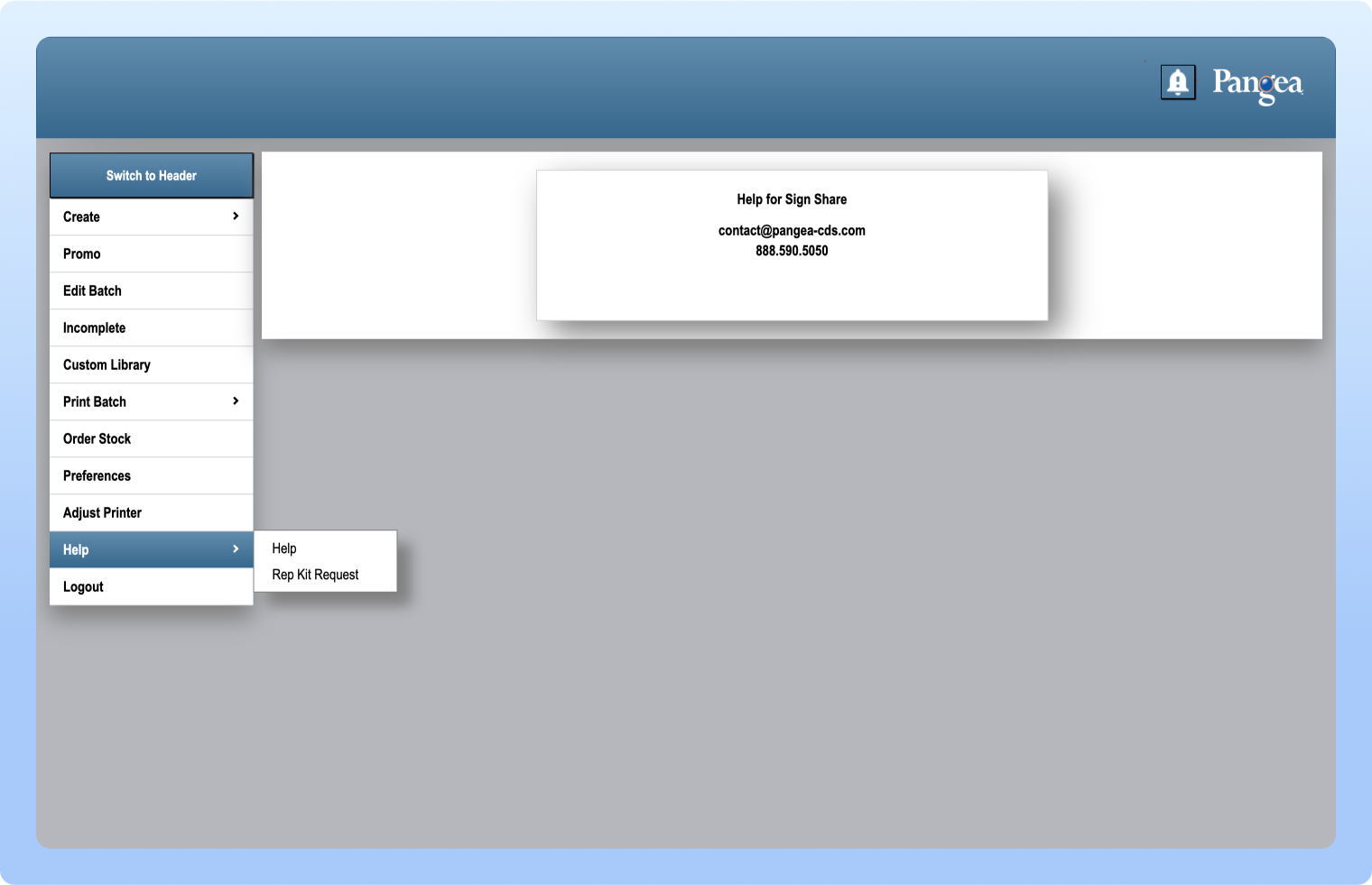
Print Batch feature is another key function for store users, allowing them to print ads uploaded by division users. In the previous design, the process was confusing after clicking, users had to press a “Proceed” button, which would then open a PDF in a new browser tab.
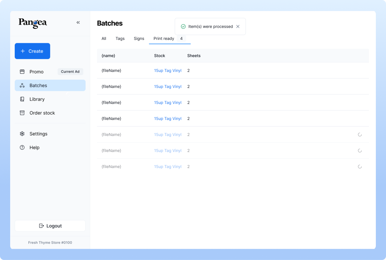
In the redesigned version, we introduced a dedicated Print Ready tab. Here, users can clearly see the quantity they’re printing and the exact file being processed. Once the print is complete, the items can be clicked and downloaded for use. During testing and iteration, we realized that users naturally expect to click “Process” first, so the system now compiles the items after that step, making the overall flow more intuitive and efficient.
5. Create graphic & submit
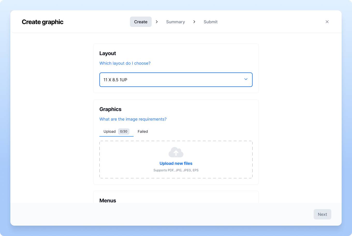
The visual design of the original Create Graphic flow was confusing, as it showed all menu options upfront before the user began, and the color combinations lacked consistency. To improve clarity, we restructured the process into three clear steps: Create, Summary, and Submit.
-
Step 1 – Create: Users set up their layout, upload graphics, and use the menu to define print type, quantity, market, and promo cycle. Multiple files can be uploaded, and users can select which ones to include.
-
Step 2 – Summary: A tabular view displays all uploaded documents. Here, users can multi-select the items they wish to submit.
-
Step 3 – Submit: Users finalize the submission, which is then sent to other stores within the organization. To help the corporate office track activity, users are also asked to provide their name, email, and contact number.
This redesigned flow streamlines the process, ensures better organization, and makes it significantly easier for new store employees to create and manage graphics with confidence.
6. Order stock
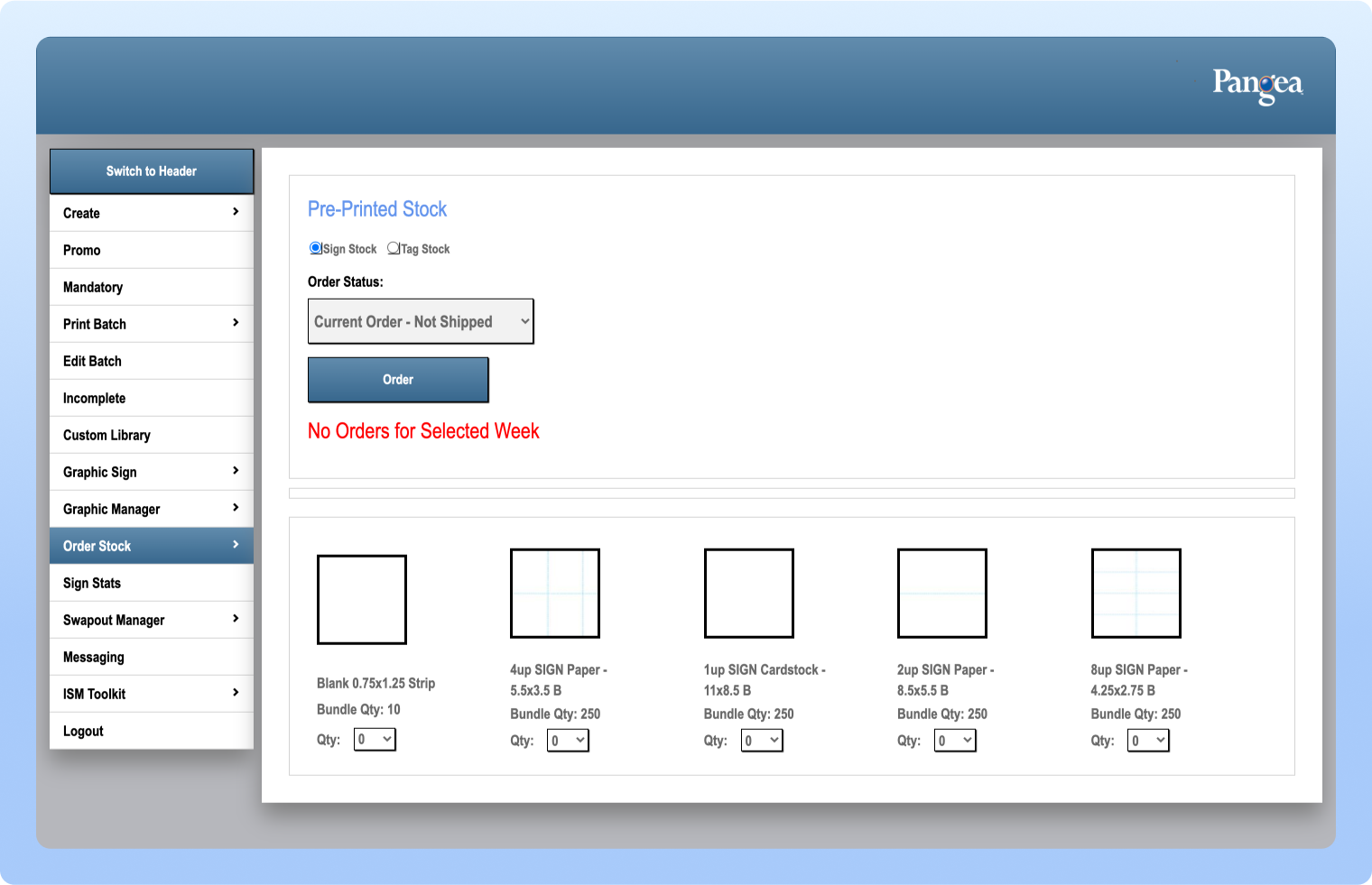
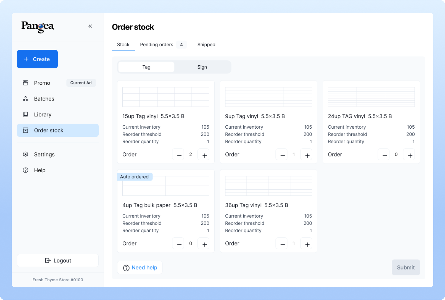
The Order Stock page was redesigned with a strong focus on UX by dividing content into clear tabs: Stock, Pending Orders, and Shipped. Separating information into tabs makes it easier for users to navigate when dealing with large amounts of data. We also made small but impactful improvements, such as adding tags to highlight stock items set to auto-order, introducing Help buttons, and enabling users to adjust item quantities directly. These changes make the page more organized, intuitive, and user-friendly.
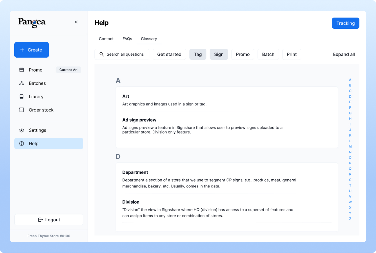
7. Help and FAQ's
The Help page was restructured, as the old design wasn’t very useful to users. We introduced an extensive Glossary, since this software has a learning curve and its unique terminology requires familiarization. The glossary tab lists all terms alphabetically, making it easier for users to understand the system. We also added a Contact section where companies can include their own details, along with an FAQ section covering common tasks such as printing, creating signs, and more. These improvements make the Help section far more useful and practical compared to the previous version.
