
Del Mar
Redesigning Saritasa's CRM will enhance departmental efficiency by integrating features for project management, schedule coordination, resource utilization, and goal alignment. Essential features include task assignment, real-time collaboration, customizable dashboards, and data analytics to optimize workflows and meet business objectives effectively. This redesign ensures streamlined operations, improved communication, enhanced productivity, and better decision-making across the organization.

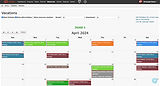
Original CRM - Dashboard
Problem Statement
Redesigning Saritasa's entire CRM tool aims to optimizing user experience for seamless navigation aligned with user goals while modernizing the outdated interface.This overhaul anticipates user behaviors by incorporating contemporary design elements, ensuring improved efficiency, smoother user paths and user satisfaction.
Challenges
The users are seeking to improve the overall design of the CRM since it's obsolete and requires better user experience to resolve some problems in everyday use.
-
Experiencing difficulty with app navigation
-
Struggling to find specific screens efficiently
-
Finding the results hard to operate without any clear filter mechanism.
-
Desiring additional calendar views (2 weeks, day view)
-
Seeking clearer visibility of assignments and tasks
-
Expressing a need for viewing overall performance metrics for company, clients, projects, and individual users
Timeline
May 2023 - Present
(In development phase)
Role
Lead UX/UI Designer
(Research, Visual Design, Design system, Interaction Design, Usability Testing)
Team
Self directed, with feedback from mentors and peers, worked closely with technical dev engineer and project manager
Uncovering Site Architecture
I began the redesign process by conducting a comprehensive discovery phase to craft an improved information architecture for the entire site. The initial step involved mapping out the flow for each navigation item and find out the userflow to begin the designs with. Starting with the existing site structure, I systematically reassembled, ensuring relevance of each user flow for a more intuitive navigation experience.

Information architecture & site map
-
Navigation
The primary challenge within the flow of the old CRM was the abundance of pages, often resulting in confusion. Numerous empty tabs and redundant components, such as dual versions of the calendar navigation, added to the clutter and inefficiency of the system. So restructure the information correctly to its respective flows was done through the help of site map.

Navigation before

Restructuring navigation
-
Permission Matrix
Subsequently, the discovery process involved identifying user roles and permissions across various departments and role types. Beginning with the most complex user type enabled a deeper understanding of the challenges that might impact visual design decisions.

User roles & permission matrix

Account preferences, matrix & department legends
Design System
Utilizing Figma, the design components and style guide were established before the wireframing phase. Variables, text styles, and color styles were meticulously set up within the software, ensuring seamless integration throughout the project timeline. This approach enabled efficient design iteration and consistency across all stages of development, optimizing productivity and adherence to project deadlines.
-
Design Components
Commenced with creating a basic component library to establish the design system gradually. Due to time constraints during design sprints, the dev and project management team facilitated the decision to save time and cost on custom components, necessitating a migration to Material 3 library compatible with Angular. Despite implementation with Material components, custom components were still developed during the design process. These challenges underscored the significance of communication with the dev team during design phases. Adapting Material components required alterations to maintain the product's authenticity and vibe.

Design component groups for individual sections
-
Style Guide
The style guide, "Del Mar," draws its inspiration from its namesake, meaning "ocean." It embodies a palette reminiscent of the natural elements, with calming blue tones reflecting the vast expanse of the sea and vibrant sun-orange hues mirroring the warmth of sunlight on the waves. This design approach not only aligns with Saritasa's brand identity, as indicated by its logo, but also serves a functional purpose. By prioritizing accessibility, particularly through thoughtful consideration of call-to-action buttons and text sizing, the Del Mar style guide ensures that the user experience remains inclusive and user-friendly for all individuals interacting with the CRM.
During this phase, challenges arose in depicting departments and work types, revealing inconsistencies requiring grouping and signification. To address this, apt color groups were assigned to departments, each encompassing specific work types represented by distinct colors. With guidance from the project manager and operations manager, this revision streamlined work type hierarchy based on organizational methods, enhancing visual clarity and coherence in information presentation.

Defining colors, variables & rearrranging the department
Design Wireframing
Following this, I initiated wireframing iterations for each navigational item as per the project manager's directives. The redesign process commenced with the dashboard, followed by the calendar, incorporating various views. Subsequently, attention shifted to refining sections for clients, projects, people, profiles, account settings, and insights. Due to time constraints, the design phase couldn't accommodate extensive opportunities for rapid interactive prototyping. However, it managed to achieve the bare minimum by supplementing designs with notes and flows for the dev team. Close communication with the dev team in the fast-paced environment ensured alignment and efficiency in implementation.
1. Dashboard & Profile Flow
Previously, the dashboard was overly cluttered, featuring holiday information, personal projects, tasks, and irrelevant tabs such as vacation calendars. The redesign was driven by input from the project manager and operations manager, focusing on simplifying the interface.
-
There was a lack of distinction between company-related and personal widgets.
-
The redesigned dashboard addresses these issues by consolidating relevant information and creating a universal layout that remains visually appealing and user-friendly.
-
Metrics for daily reporting, project tasks, and assignments for the current and next week were emphasized to streamline user workflow.
-
Custom time clocks were integrated to accommodate remote work across different time zones, facilitating efficient communication. Upcoming events were added to complement company holidays, with a separate tab for personal events.
-
The introduction of a scoreboard served as a motivational tool, displaying performance scores and user comments.

Original dashboard & profile page flow

New dashboard & profile page flow
2. Calendar
The original CRM tool had calendars scattered across different locations, making it difficult to manage office holidays, employee vacations, and sick days effectively.
-
To remedy this, a key requirement emerged: consolidate calendars for both individual and company-wide events, with filters for department, project, branch, and pending/approved time-off events.
-
Users gained the ability to view the public company calendar and filter it by relevance, while overlaying their personal working days or holiday calendars.
-
Introducing three calendar views—month, day, and two weeks—enhanced user experience, addressing the challenge of displaying multiple people in the same event with clarity and ease of use, tailored for individual user needs.
Original calendar flow

New calendar & time off flow
3. Projects & Clients
The workflow for projects and clients is essentially similar, where each client and project holds distinct information.In the original designs, long lists of sub-items within tables led to tedious scrolling and slow loading times due to the abundance of data displayed on the default client page.
-
Redesigning the structure of both client and project lists aimed to streamline navigation, ensuring an easy and quick process for users to navigate through.
-
By creating a similar flow for both sections, users could engage more effectively and become familiar with a smoother UX experience.
-
Metrics were introduced to display the hours spent on each client, facilitating seamless billing processes. The redesign of these flows aimed to present data in an elegant yet holistic manner, fulfilling the needs of end users effectively.
-
Introducing a right panel upon clicking projects/clients provided users with immediate access to key information, alleviating these issues. Multiple rounds of testing across diverse user groups were conducted to ensure that the redesign met the requirements of all user types.

Original clients & projects flow

New clients & projects flow
4. People & Account Preferences
The navigation for account preferences is under the control of the super admin, granting the members centralized authority over these settings. A permission matrix is being introduced to assign varying levels of access to different user roles, simplifying the process of granting permissions and providing more clarity.
-
This redesign aims to streamline the user flow, making it easier for administrators to assign permissions to specific user roles and avoiding the confusion and redundancy present in the previous design. The credential sprint and redesign were prompted by the technical manager, who faced challenges with manual management of permissions, departments, and work types.This redesigned experience effectively addresses the issues raised by developers, providing a solution to the challenges encountered with manual management.
-
The introduction of user roles allows for the categorisation of users into different groups based on their responsibilities and access needs, enabling more efficient management of permissions through Role-Based Access Control (RBAC).
-
The 'People' navigation section will display a list of individuals along with their important information, facilitating effective relationship management within the CRM platform.
-
Introducing high-level functions for the super admin resolves the lack of clarity regarding their role in the old CRM, providing users with a more satisfying and visually appealing experience while achieving the objective.
-
Additionally, the feature to add departments and work types has been introduced, allowing the super admin to manage these manually. Previously, this may have been handled in the backend.

Original clients & projects flow

New clients & projects flow
Development phase
Collaborating closely with the development teams, issues were identified amidst time constraints and concurrent client projects. The CRM's original design adhered to Material Design 2. However, during the redesign, the initial dashboard and calendar setups necessitated custom elements within the new design system. This led to extensive development time. To meet strict deadlines, the midway designs had to align with the Material 3 component library. Presently, the development team is still working on most designs and creating responsive web behaviour. Notably, the dashboard, calendar, and clients section are nearing completion.These designs are still in QA testing and have not been live yet to all the users.
1. Dashboard

Dashboard in development
Currently, the development focus is on the dashboard. The projects section is undergoing development, resulting in the empty state of the "My Projects" section. There are specific issues requiring attention from the development team. For instance, the functionality of "My Events" within the widgets is currently not functioning as intended and needs further refinement.
2. Calendar

Calendar in development
The calendar section offers three views: 2 weeks, month, and day. However, all design elements are custom and require revision. Visual design adjustments are necessary to reduce density. Additionally, there are implementation gaps; for instance, modals are not synchronized with provided designs, and the office holiday feature lacks appropriate filters.
3. Clients

Clients section in development
The client list table functions correctly, but the visual design of the right panel requires refinement. User feedback indicates that the new design enhances the overall experience by reducing clicks and simplifying search and navigation compared to older versions. The filtering mechanism enables users to quickly access projects from the client navigation. Additionally, the new design effectively addresses the cascading relationship between clients, projects, and tasks.